Flower buying guide
How to Choose a Flower Color Palette Without Overthinking It
Choose flower colors from the recipient's real preferences rather than universal symbolism or exact-photo assumptions.
By Bloom Lane Flowers · Published
Options to compare
Formats to consider
Consider these formats only if flowers are welcome. Compare the selected size and palette, and confirm any essential ingredients, dimensions or receiving details before ordering.
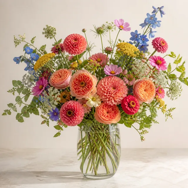
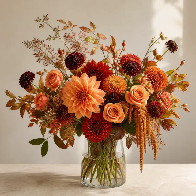
Check the selected product, delivery ZIP and available date before ordering. Availability and timing require confirmation; a requested arrival time or occasion deadline is not guaranteed by an available delivery day.
The most useful flower color is one the recipient actually likes. Start with something they have told you or a preference you know well, then select a broad palette that reflects it. You do not need to decode a supposed universal meaning for every shade.
If you know little about their taste, asking is more reliable than making the occasion choose for them. “Do you prefer softer colors or a brighter mix?” is a small question that can save a lot of speculation.
Use evidence in order of confidence
A direct statement is the strongest starting point: “I love yellow flowers” gives you a clearer direction than a theory about what yellow is supposed to express. A previous gift they specifically enjoyed can also be useful, especially if they mentioned its colors rather than merely thanking you.
Repeated personal choices may offer a clue, but keep that clue in proportion. Someone who wears dark clothing may still love bright flowers. A home decorated in neutral colors does not necessarily need a white arrangement. Clothing and decor are not instructions for every future gift.
Your own preference belongs further down the list. It is fine to choose something you find beautiful when the recipient enjoys surprises, but distinguish that from knowing their favorite. You can say “I thought these were lovely” without pretending you selected an objectively correct color for their personality.
Pick a direction, not a secret message
A palette describes a visual direction. It can be light or saturated, focused on a few related tones or a more varied seasonal mix. The card can carry the reason for the gift in ordinary words.
If you are saying thank you, say what you appreciate. If you are marking a birthday, write the birthday wish. There is no need to depend on the recipient interpreting a color as gratitude, friendship or affection.
Personal and cultural associations can matter when the recipient has told you about them. Respect those preferences rather than replacing them with a generic symbolism chart. If a particular color would be unwelcome, knowing that is more useful than knowing what an unrelated source says it “means.”
For a professional gift, clarity about the sender and reason matters more than choosing a supposedly neutral shade. For a close friend, the color they enjoy may be more personal than the palette traditionally associated with the occasion.
Compare the actual palette labels
Gathered Garden is a mixed garden arrangement in a clear glass vase. Its catalog palette labels include Seasonal garden, Cream, white & ivory, Soft pastel, Blue & lavender, Yellow & cream, Pink & blush and Red & wine.
These names are helpful because they describe combinations rather than isolated color swatches. Someone who asks for “white flowers” might enjoy the cream, white and ivory direction, but you should not silently equate that with a requirement for pure white only. Likewise, Blue & lavender is a mixed direction, not a promise that every flower will be blue.
Designer’s Choice also offers palette directions, including White & green and Bright & joyful, with the palette treated as a preference. It is useful when you want to guide the overall look while leaving the flower selection to the florist.
Choose between these products by their described format and design approach as well as their colors. A palette name alone does not tell you the arrangement’s dimensions, specific flower ingredients or current availability.
When two palettes both seem right
Suppose your friend likes both pink and lavender. You do not need to discover which color ranks first in every situation. You can choose a Soft pastel direction if a mixed lighter palette appeals to them, or a Pink & blush direction if you want to emphasize that known preference.
The decision can be equally simple for someone who enjoys color without a clear favorite. A seasonal direction may suit their openness to variety. That is different from assuming seasonal colors will match a particular room or include one exact flower.
If you are choosing for your own home, think about the visual effect you want in the intended spot. You might prefer flowers that contrast with the room rather than blend into it. There is no rule that flowers must match the sofa, table linen or wall paint.
Stop when the preference is clear enough
An ordinary gift rarely needs an exact shade specification. A broad direction can be enough if the recipient is comfortable with variation. Once you have a real preference, a suitable product and an acceptable degree of flexibility, extra symbolism research is unlikely to improve the choice.
Exact matching is a different decision. If a specific shade is indispensable, ask whether it can be confirmed before ordering; do not assume a palette option or photograph guarantees it. If the answer is unclear, keep the requirement unresolved rather than describing it as arranged.
Choose colors the person will enjoy, leave creative room where you genuinely can and use your note to explain the gesture. The flowers do not have to do all the communicating.